Published
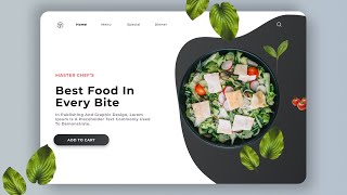
In this video we wil learn how to make complete responsive food / restaurant website design using html css and vanilla javascript.
We will create a mobile first food responsive design using html css and javascript. The mobile first design is easy to make and we will leran how to make responsive food website design from scratch.
the main feature of this website are:
✔ responsive header / navbar with toggle menu bar effect.
✔ responsive home section with touch slider using splide.js
✔ responsive dishes card section using grid.
✔ responsive about section using grid.
✔ responsive menu card section using grid.
✔ responsive team section using grid.
✔ responsive contact us form section.
✔ responsive footer section using grid.
✔ scroll bar design.
✔ responsive loader page.
Link for code and images:
https://bit.ly/3NxoPPM
splide js:
https://splidejs.com/
font awesome link:
https://fontawesome.com/
Google fonts:
https://fonts.google.com/share?selection.family=Dancing%20Script:wght@700%7CLato:wght@300;400;700;900
Timestamps:
0:00 Demo
01:35 File Structure
01:50 Set up The Page
03:13 Header Section
14:45 Home Section
20:00 Dishes Section
26:25 About Section
29:55 Team Section
34:49 Menu Section
40:27 Contact Us Section
50:30 Footer Section
55:04 Scroll Bar
55:55 Scrollspy
57:58 Loader Section
1:00:13 Final Demo
Please Don't forget to Like, Share And Subscribe.
Thank You.
#html #css #css3 #javascript #js #html5 #tutorial #tutorials #htmltutorial #programming #csstutorial #javascripttutorials
- Category
- Web design
Be the first to comment
-
1:22:50

Complete Responsive Food / Restaurant Website Design Using HTML / CSS / JAVASCRIPT - From Scratch
-
2:29:57
Complete Responsive Food / Restaurant Website Design Using HTML/CSS/ JAVASCRIPT From Scratch
-
56:16
Complete Responsive Food / Restaurant Website Design Using HTML CSS and JavaScript
-
1:23:58
Complete Responsive Food / Restaurant Website Design Using HTML / CSS / JAVASCRIPT - From Scratch
-
1:22:35
Complete Responsive Food / Restaurant Website Design Using HTML / CSS / JAVASCRIPT - From Scratch
-
3:07:55
Complete Responsive Food / Restaurant Website Design Using HTML / CSS / JAVASCRIPT - FREE
-
02:28
Complete Responsive Food / Restaurant Website Design Using HTML / CSS / JAVASCRIPT
-
2:47:02
how to make complete responsive food / restaurant website design using html css and javascript.
-
01:07
Complete Responsive Food / Restaurant Website Design Using HTML / CSS / JAVASCRIPT -
-
00:49
Complete Responsive Food / Restaurant Website Design Using HTML / CSS / JAVASCRIPT
-
00:19

Brookville Web Design - Instant Web Tools
-
05:12

টাকা ধার দেওয়ার চুক্তিপত্র লেখার নিয়ম, চুক্তিপত্র দলিল লেখার নিয়ম, Loan Agreement
-
01:33

FREE WEB Design Course 2022 | Free Online Web Designing Courses Earn Money Online using Web Design
-
49:19

Workout Tracking App Using Notion API, Python Flask & React JS Charts
-
00:27

html AND css l Loding animation l Webdevelopment
-
06:21

বিনিয়োগ চুক্তিপত্র লেখার নিয়ম, ব্যবসায়ের চুক্তিপত্র লেখার নিয়ম, Business investments Deed
-
03:22

Working Contact Form Using HTML, CSS, JAVASCRIPT and FIREBASE | Coding Vlogs
-
15:22
![Creative Navigation Menu Indicator with HTML, CSS and jQuery Plus [Source Code]](https://i.ytimg.com/vi/HB_3PolUWNU/mqdefault.jpg)
Creative Navigation Menu Indicator with HTML, CSS and jQuery Plus [Source Code]
-
11:14
Food Ordar E-Commerce Website Design | Figma Tutorial | Figma Speed Art Tutorial | 2021 | Part 02 |
