Published
Add BreakPoints through Media Queries to Create a Responsive Website.
Here is a quick web design series for those who are willing to start Web Design. Useful Links Below:
Mozila CSS Reference: https://developer.mozilla.org/en-US/docs/Learn/CSS/CSS_layout/Flexbox#why_flexbox
VSCode Download: https://code.visualstudio.com/Download
W3School: https://www.w3schools.com/css/css_intro.asp
Buy me a coffee: https://buymeacoffee.com/ds.official
Please subscribe to support!
Follow me on Instagram: https://www.instagram.com/razabayani/
Follow me on Facebook: https://www.facebook.com/grazabayani
Get connected on LinkedIn: https://www.linkedin.com/in/razabayani
Hashtags:
#html5 #css3 #web #code #web_design #ui #ux #uiux #html #frontend #flexbox
- Category
- Web design
Be the first to comment
-
45:01

Project 4: How to design responsive website with CSS Media Query |Web Dev Course #31| Newton School
-
11:11
#8- What is Internal CSS? | What are CSS3 Selectors| Quick Web Design Series | #html5 #web #ui #css3
-
1:03:23
Responsive Web Design with HTML5 and CSS3 [Responsive Website Using HTML and CSS] Media Query in CSS
-
12:10
#15- How to Easily Create Navbar with Dropdown in HTML5 and CSS3 | Quick Web Design Series | #css3
-
26:15
How To Make Website Using HTML & CSS | Full Responsive Website Design Step by Step With Media Query
-
05:28
#7- How to Get Started with CSS3 in 2022| Quick Web Design Series | #html5 #web #ui #css3
-
15:06
Media Query | Responsive Web Design #1
-
47:38
Media query | responsive website using HTML css
-
00:05
Media Query Tutorial For Beginners Media Query In CSS How To Make Responsive Website #shorts
-
05:59
Dreamweaver Quick Start 7: Creating a Media Query
-
00:19

Brookville Web Design - Instant Web Tools
-
05:12

টাকা ধার দেওয়ার চুক্তিপত্র লেখার নিয়ম, চুক্তিপত্র দলিল লেখার নিয়ম, Loan Agreement
-
01:33

FREE WEB Design Course 2022 | Free Online Web Designing Courses Earn Money Online using Web Design
-
49:19

Workout Tracking App Using Notion API, Python Flask & React JS Charts
-
00:27

html AND css l Loding animation l Webdevelopment
-
06:21

বিনিয়োগ চুক্তিপত্র লেখার নিয়ম, ব্যবসায়ের চুক্তিপত্র লেখার নিয়ম, Business investments Deed
-
03:22

Working Contact Form Using HTML, CSS, JAVASCRIPT and FIREBASE | Coding Vlogs
-
15:22
![Creative Navigation Menu Indicator with HTML, CSS and jQuery Plus [Source Code]](https://i.ytimg.com/vi/HB_3PolUWNU/mqdefault.jpg)
Creative Navigation Menu Indicator with HTML, CSS and jQuery Plus [Source Code]
-
11:14
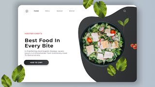
Food Ordar E-Commerce Website Design | Figma Tutorial | Figma Speed Art Tutorial | 2021 | Part 02 |
